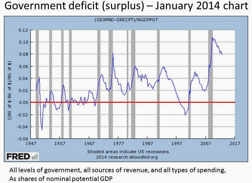
Here's a chart I made in Spring, 2013 (the last data point seems to be 2012, 4th quarter). It shows a particular measure of whether the government is running a surplus (negative numbers on this chart) or a deficit (positive numbers on the chart). I've added the red line at zero to make it easier to distinguish surplus (below the line) from deficit (above the line). The denominator is the nominal potential GDP, so that the more recent numbers don't overwhelm the early ones merely by being the product of a much larger economy with higher prices.
Here's the same chart, produced this evening. The FRED site sets the vertical scale for you in order to accommodate the data, so the lines look quite similar, but I've again added a red line, and some differences are clearly visible. In general, the later line seems to have been shifted upward by a couple of percentage points in the earlier part of the data, and half to a full percentage point in the later.
My earlier data puzzle concerned the nominal GDP and the nominal potential GDP, and because my original chart there only showed the difference between the two, I couldn't tell which of those two data series had changed, only that at least one of them had (either the figures for nominal GDP had been made larger, or the figures for potential GDP had been made smaller).
The charts for this new puzzle also include nominal potential GDP, so the first obvious possibility is that this is the culprit in both, but that actually doesn't fit the facts. Potential GDP is strictly in the denominator here, so making it smaller wouldn't have the effect of shifting everything up. More specifically, if you compare the two charts I've presented here, you can find data points that are negative on the earlier chart and positive on the later one. That means that there has to be a problem in the numerator: government current expenditures are now recorded as larger, or government current receipts are now recorded as smaller.
Either way, it's a new problem, not just another occurrence of the same problem as before.


I don't know what any of this means. This isn't a snide comment or joke - I honestly don't understand what you are pointing out. Maybe I lack the math and/or vocabulary.
ReplyDeleteLook at ... what is it? 1954? the highest point in that second gray bar. In the older chart, the value is just about 0 at that peak. In the new chart, the value is about 0.02, or 2%.
DeleteOr if you look at the little blip before that, around 1952: in the older chart, the value is about -0.015 (-1.5%), while in the new one that same little local peak is something like 0.005 (0.5%). The older chart shows a negative number, implying that expenditures were smaller than revenues (the government was running a surplus). The new chart says that expenditures were larger than revenues (the government was running a deficit).
The reality of 1952 didn't change, but some time around Summer, 2013, the data provided by FRED to describe 1952 did change. They used to say we had a surplus in 1952, and now they say it was a deficit.
There's all sorts of data that come out with initial estimates and then revisions as more complete numbers come into the offices of the government statisticians who prepare this stuff. For example, the GDP figures for a given quarter come out in three main versions, and everyone knows that the first one is just the best estimate possible with the data available at the time. But the revisions happen on the order of the next several months, and the revisions are generally tweaks. There's no standard practice of going back 60 years and making wholesale changes to the data.
This case with the government expenditure and revenue data is perhaps even more troubling than the earlier one about GDP and potential GDP. GDP is by its nature an estimate, with various imputations and other ways of filling in things we wish we knew but can't measure very precisely. And potential GDP is a hairier beast; it's not even something we measure, but rather something we calculate based on models and assumptions about what the unemployment rate "should" be. So revisions to that make some sense if there's a new methodology (though revisions as large as the ones I described in the earlier post don't make much sense).
This stuff is different. This is, How much money did the government collect? How much money did the government spend? There's no estimating involved. Governments keep account books that tell them with reasonable precision what both of those numbers are. To suddenly go back and say that government accounting was off by about 2% of GDP simply makes no sense.
And we certainly knew at the time whether we had a deficit or a surplus, so for FRED data to change from indicating one to indicating the other makes even less sense.
Does that clarify what I'm getting at?
Total clarity achieved. Your third paragraph was the key for me. And, um, huh. How is this happening?
ReplyDeleteI wish I knew. Kristin thinks maybe they're blocking my email. Or else someone is scrambling around at the St. Louis Fed trying to figure it out (I checked last night, and the data are still in their new "wrong" status).
Delete